
Particular Presence
At a Glance
What we do
We provide comprehensive technology consulting services that help organizations optimize, secure, and modernize their technology infrastructure.
What we believe
True partnerships promote teamwork, helping everyone learn, share, and grow together with trust and openness.
Key Messages
We Drive Results Through...
Very Particular Partnerships
Very Particular Expertise
Very Particular Attention

Logo
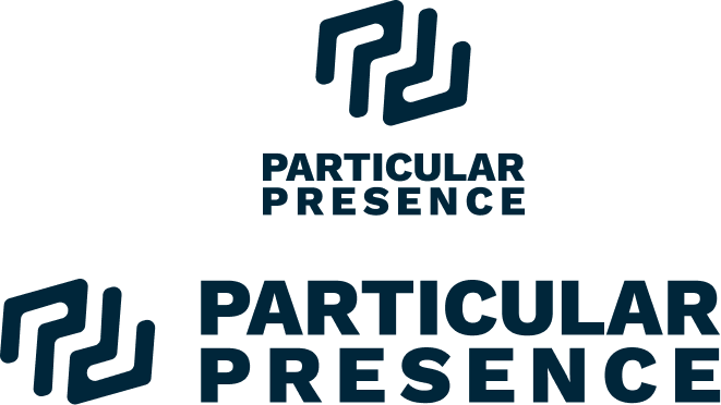
Main Logo
The main logo is designed to go on white or light backgrounds, the logo font is Work Sans (see more in the typography section).

RGB: 16, 102, 79
HEX: 10664F
CMYK: 84%, 0%, 23%, 60%
PANTONE: 336 C
minimum width:
295px (at 96dpi)
25 mm when printed
to ensure accuracy
use a mm to px converter
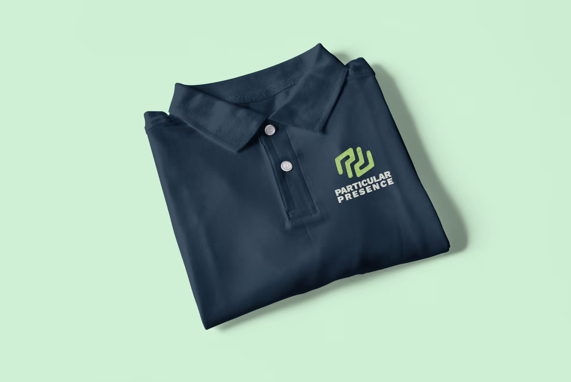
Symbol
Main Symbol
The symbol is another brand element. We call it the Particular icon

RGB: 0, 38, 58
HEX: 00263A
CMYK: 23 8 0 77
Pantone: 539 C
Minimum clearing space
The minimum clear space is based on a 1/8 scale version of the symbol


Sample Usage
Use the Particular Icon on apparel, especially black or charcoal
Logo Variations
The main logo is preferred whenever it can be used. If you cannot achieve a 3:1 contrast ratio with the main logo, we have provided a variation for dark backgrounds. (use this contrast ratio checker to test contrast ratios).
Light Logo

RGB: 230, 234,220
HEX: E6EADC
CMYK: 2 0 5 8
Pantone: (no matching pantone)
Minimum width:
295px (at 96dpi)
25 mm when printed
to ensure accuracy
use a mm to px converter
Horizontal variations
2-colour horizontal (screen)

2-colour horizontal (print)
this version is designed to work with both pigments and on screens.
use a mm to px converter
Logo No-nos
How not to use or alter the logo. These are examples of improper usage that take away from the consistency and recognition of the brand
.jpg)


.svg)
Colour
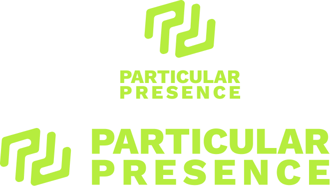
Bold, intentional use of colour is key to the Particular Presence identity. Don’t hesitate to use colour, but always with purpose. Deep blue is primarily used as a background colour, and we offer two variations of yellow-green—one optimized for screens and another for print.
00664F
B7DD79
E6EADC
Typography
Work Sans is a modern sans-serif typeface designed by Wei Huang, focusing on legibility and neutrality. It features open letterforms, a balanced x-height, and a variety of weights, making it versatile for both digital and print applications.
The approachable yet professional appearance reflects the Particular Presence focus on reliability, collaboration, and empowerment.. The font enhances clear communication, essential for technology consulting and is available in various weights allowing for consistent branding across different mediums.
Overall, Work Sans effectively communicates your brand identity as a reliable partner delivering technically sound solutions.


Cobranding/Partnerships
Particular Presence will sometimes strategically partner with another brand to collaborate to create a joint campaign, product or service. Below are the guidelines to follow when Particular Presence is the lead brand.
Clearance when cobranding
When cobranding, give spacing of two capital letter E's between the logo and cobrand


Pattern and Motif
By systematically repeating the logo symbol, we establish a motif that not only reinforces brand recognition but also enhances the visual appeal of our materials. Thoughtful incorporation of motifs adds distinction to a design which can helps with impact and memorability.
Rectangular
The simplest pattern is our repeating rectangular pattern.

The recommended tile size is 48px
Half Brick
The half-brick pattern is more refined, created by offsetting the symbol in each row.

The recommended tile size is 48px
Variations and oversized pattern
Both the half-brick and rectangular patterns can be presented in oversized variations for effect. Ideally, the oversized versions should be 120% of their target container (or more). The result is that parts of the tile extend beyond the bounds of the container. Feel free to offset the tile to show parts that best accentuate your given design.
Motion Principles
We anchor our motion with easing curves that bounce. These can be elastic, bounce or overshoot curves.
Application Examples
Animated logo
In this example, the left side of the logo is animated with a bounce easing curve
Sequence animation
This animation can be used for a full screen transition. Note the integration of elastic/bouncy easing animation. Also notice that there is a "rest" period at the end of the animation. We use an oval that grows to fill the background as it feels smoother than a square or rectangle.
Social
Consistency on social media sites is important to establish brand recognition. We use the assets below in your social feeds to distinguish our brand.
Application Examples
Covers and Profile Images
We have designed covers and profile images for various social media sites.
Get Covers & Profile Images